
Eat For The Earth
Redesigning and restructuring a website aimed to help people find vegan lifestyle resources in order to improve their health


Role: Lead UX Researcher and Designer
Timeline: 5 weeks
Changing your health and the planet through plants
About Eat for the Earth
Eat for the earth aims to educate underpriveleged individuals who are suffering from health problems, such as diabetes and obesity, on the benefits that living a vegan lifestyle can have on their health.
The owner of EFTE aims to educate users through community programs, videos, recipes, and blog posts.

The Objective
My client wants to improve the overall organization of the site and increase volunteering, fundraising, and sign ups for community events.
My Goals
Conduct user research to understand the pain points of the current site and validate improvements in information architecture
Improve the users ability to navigate the website and access desired features by streamlining content and creating an intuitive navigational menu
Improve the visibility and accessibility of volunteering and fundraising by showcasing necessary forms without comprimising on educational content
What do other educational sites have in common?
Market research showed that other educational sites utilize similar principles to engage users and allow for an easy educational experience.
-
Utilization of expandable and scrollable information so that users can easily see one piece of information at a time
-
A simple home page with clear navigation to the user’s intended resource and donation’s
-
Call to actions are clear and consistent
Meet Helena
I used the information from initial research and client interview to create a persona, Helena.
Helena is a loving mother of 3 children and both her and her husband work full time job’s as field workers in northern California. She has become reliant on pre-packaged and fast food due to there being little time in her families schedule and the lack of access to healthy, cheap food. Her doctor says that she must make a change in her diet due to her pre-diabetes diagnoses. She is referred to Eat for the Earth to get started and recieve community help but because of the overabundance of information, she struggles to know where to start.

Goals:
-
Educate herself on veganism
-
Feel and see progress in her health
-
Participate in her community
-
Feel supported in her changes
Frustrations:
-
Unclear what resources are available
-
It’s difficult to navigate to find upcoming events near her
-
Does not have the time to read multiple articles
What is the current experience on Eat for the Earth?

The user flow shows that there are many page options for users to get lost in order to find the sign up forms for community programs.
User Flow Key

The current journey map shows that Helena becomes less motivated as she navigates the website. She has difficulty finding where to sign up. The lack of clarity after already feeling defeated by her own health causes Helena to be less likely to utilize the site.
What do users need?
I conducted user interviews with users that currently follow a vegan lifestyle and are active in the community in order to learn how they educate themselves on their lifestyle choices.
Through an affinity map, I found the following needs:
-
“I need what I read to be short and organized so that I can save time”
-
“I am more inclined to donate when I have clear information on who runs the organization”
-
“I like a calm and simple interface so I can focus on the information”
Through usability testing of the original site, I was also able to understand the following user behaviors and concerns:
-
Users found the information architecture to be confusing and redundant
-
Users appreciate having access to a variety of information
-
Users need a pared down interface to be able to focus on the information provided to them.
Developing a more intuitive website
Based on my user research and client requests, I came up with some solutions to improve the organization of the site and create an experience that allows users to be able to quickly access their intended resources.
I focused on the following changes:
Improve information architecture by consolidating pages with redundant information, creating a quicker navigational experience
Implement expandable information to limit the clutter on screen for users and ensure they can easily access the educational content they came for
Priotize call to actions by displaying volunteering, sign ups, and community events on the front page.
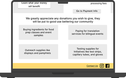
Clearly define the organizations mission and use of funds to promote donation
Mid Fidelity Prototype
The clients allowed me free creative control and only asked that the logo be kept the same.
In my mid-fidelity prototype, I made the following changes to address my users needs and pain points:
Filters for desired resources
Concise navigation bar
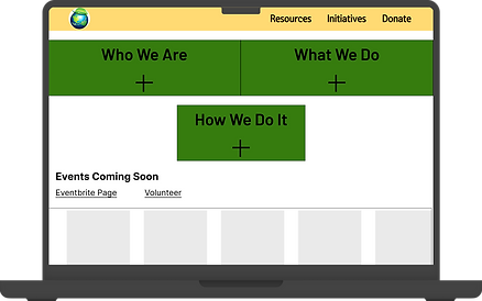
Expandable information
Carousel of upcoming events

Initiatives housed together

Info cards for quick reading
Clear and upfront CTA's
Upfront material on donation uses
How did the users feel?
I conducted user testing using the following prompts:
-
You would like to sign up for the Community RX intitiative. Show me how you would do that.
-
You would like to make a donation to Eat for the Earth, please show me how you would do that. How comfortable/willing are you to donate to this organization based on the information you have seen?
-
You would like to find a new recipe that can improve your health. Show me how you would do that?
Prompt 1
Less pages make a bigger impact
Result: All users were successful in finding the Initiatives page and locating the sign up button in under one minute with fewer than 1 error.
Takeaways: Users appreciated a concise navigation bar and being able to locate the call to action button immediately.
Prompt 2
Upfront information instills trust
Result: Users were able to navigate to the donations page in under 30 seconds with no errors. They were pleased with being able to see where the money would be going but expressed also wanting to be able to know about the organization as a whole.
Takeaways: Need to relocate organization mission to where it will be more impactful.
Prompt 3
Filters provide needed clarity
Result: Users were able to navigate to the resources page successfully in under a minute with fewer than 2 errors. A few users scrolled on the home page first but quickly redirected to resources.
Takeaways: Having the resources filter at the top of the page is key to reassure users they are in the correct place.

Changing for the better
Taking into account the feedback from usability testing, I made the following changes to the high fidelity prototype.
However, due to time constraints, I was not able to create a fully responsive design for the mobile devices as I would have liked.
-
Relocated Eat for the Earth's mission to the donation page.
-
Removed “How we do it” section due to redundancy.
-
Removed intro banners at the top of initiatives and resource pages due to redundancy.


Usability improved by 7 SUS points
System Usability Scale (SUS) Scores increased by over 7 points with my changes. Overall, users had a more pleasant experience and were able to perform their tasks in less time and with minimal errors.
Next steps
I am currently working through the clients desired hosting website to build out my design. Once up and running, I would like to assess its performance and make some changes. In the future I am hopeful I can perform the following iterations:
Create a fully responsive design with design choices exclusive to the mobile layout. Due to the learning curve of the hosting website chosen by my client, I am choosing to focus on creating the wesbite according to the current design with the ability to add these features upon completion.
Build out a calendar feature in the site. The client currently uses and links out to third party sites and did not wish to change this at the time. I would like to test out adding apps within the site to reduce the amount of pages users have to visit.
Design and test a toggle for desired language. The client expressed that many users are part of the latinx community. I believe it would be a helpful feature for some users to be able to toggle the entire sites language to spanish without having to use a browser extension.
Reflections
-
Being able to accurately estimate timelines saves everyone headache- I wrongly estiimated the length of time I would need for this project due to my lack of knowledge and experience in the web hosting site the client wishes to use. In the future, I will take the final location of the design into account more pertinently
-
Sometimes we can’t be picky- I originally intended to only interview users who are actively enrolled in EFTE’s volunteer or outreach programs but the small sample size and specificity of this group proved difficult. I was able to get meaningful data from users who are active parts of the vegan community even if it was not my original plan.
-
Free rein can hurt at first- As someone who loves structure and rules, I struggled at first with being given almost no pre-existing design structures to work within. I had to step outside of my comfort zone and rely on my ability to do extensive market research to get my footing on what design choices are must haves.